Making a better member centre

In 2019 Equifax in the UK embarked on a project to redesign its consumer offering.
The Problem
At one point the B2C offering provided by Equifax was the most comprehensive credit reporting solution available to UK consumers, it was built on the most accurate dataset in the market driving a credit score that was more reflective of those used in industry and featuring a range of diagnostic elements that were designed to guide users to specific areas of concern though a category based traffic light system and alert users to changes to their credit files that may indicate identity theft. This functionality was later supplemented by dark web monitoring and social media monitoring tools to help identify what information is available on the internet that could compromise a users identity. While the toolset was complrehensive the issue was that the user experience had evolved and grown through 3 iterations in terms features and functionality the presentation layer was built on a technical and presentational architecture that had first been introduced in 2004 and by 2019 was obsolete in comparisson to the technical best practice, usability and accessibility standards of the time.
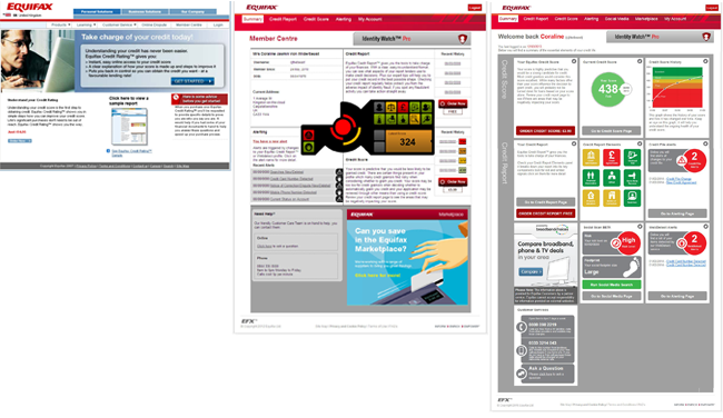
Above: from the left Version 1 to 3 of the member centre 2005 to 2021
While the technical architecture was being redesigned a user research project asd intiated in order to understand the scale of the issues present in the current experience, it was established to identify the following:
- Features that users believed have value
- Pain points in the user experience
- A Prioritisation list for 1 and 2
- Future features that users would like to see
This round of research would result in 63 recommendations across the 4 research areas.
The Users
In theory, the entire adult population of the UK are potential users of the service, so a sample was chosen to represent the widest possible demographic within the available budget.
Process and Iterations
The design process was based on the double diamond method with the initial round of research being used as a primary element of the discovery phase and a benchmarking exercise that would inform the focus and priorities and a number deliverables and working hypotheses for the project.
The second phase was to revisit every aspect of the product including its service design, information architecture, product and feature mix, UI (User Interface) design, responsiveness, accessibility, branding and content/tone of voice, aligning each element to solve the issues identified in the first phase, in parallel to this work was undertaken evolving the latest brand elements into a supporting design system for the service and a project evolving the underlying score model and range was initiated.
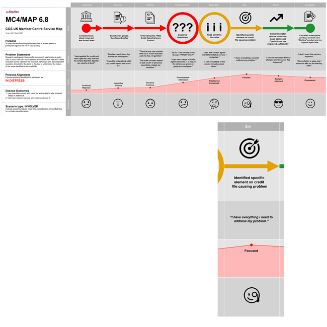
Above: User journey service design fragment, part of a larger service design user journey were explored down to the indvidual user persona to understand how users interact with the service, their entry and exit points
In the third phase a range of presentation options were rapidly developed into wireframes using AXURE RP, these wireframes were used as guidance for the UI visualisation and content design as well as a briefing point for the development team to enable them to story point various UI elements.
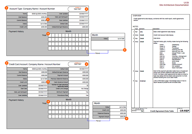
Above: Example wireframe fragment with supporting descriptive elements.
In the fourth phase a semi-functional and dynamic prototype was built from the visualisations in phase three and additional user research was undertaken to select the best candidates for further refinement and to evaluate the design against the WCAG 2 standard, a series of iterative cycles formed part of this stage.
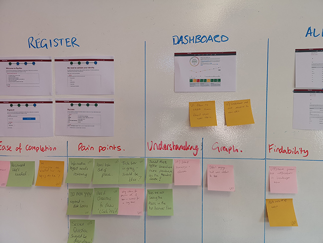
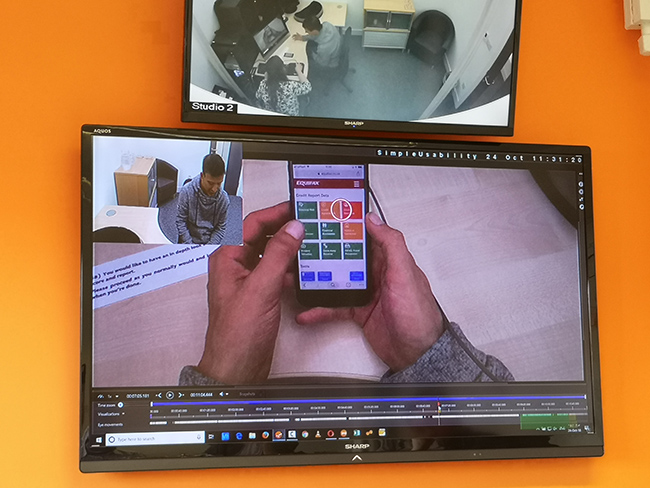
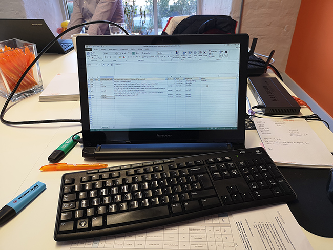
Above: Testing of an early design semi-functional prototype user research session that consisted of qualitative task driven interview session incorporating eye tracking, in the background the team recorded and categorised insights in real time.
Final design
The service was launched in two phases starting early in 2021 with the release of the “Statutory” version of the service, this was followed later that year with the fully featured version of the service.
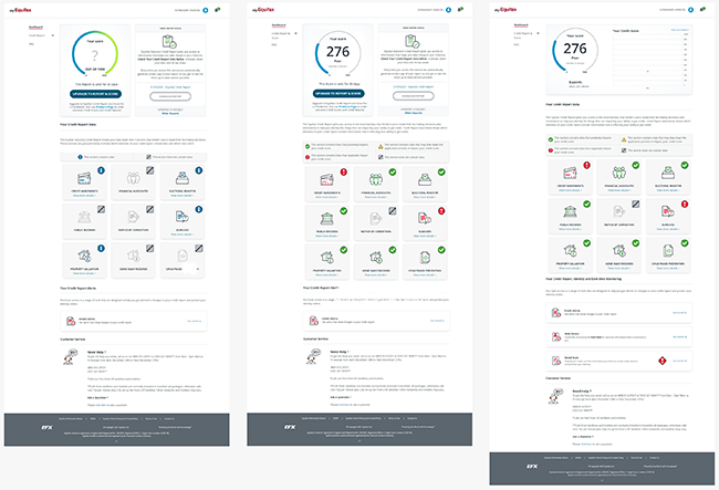
Above: Equifax member centre version 4 dashboard in its three product configuration, from the left; Statutory Report, One time Score, Fully featured.
The final design was created to equip the business with the ability to be competitive in the current climate and enable further features to be added to the service as the business develops.
Thoughts and takeaways
This project was enormous in scope, not only was it to replace the previous implementation of the service but it also served as a case study for how the rest of the international business could implement a transformation of its B2C services, while the product features do not directly align there were lots of elements that could be adapted and reused. Always include extensibilty as a part of the design.
No matter how thoroughly a feature or element has been thought through it is critically important to include user research at as many stages as possible, the closer you are to the user the better the service will be.

